
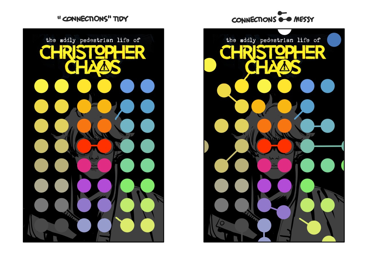
Sometimes a cover is best as a simple picture of the person standing there, or a dynamic action shot. Other times, a completely different approach works out better and leads to more interesting places. Here’s a case of the latter working out better. How did I end up with these circles?
Not “seeing” anything
I’m about 90% sure that I have aphantasia, which means I don’t see pictures in my head.
If I really make an effort I can do a version of it, but it is very much like tracing a finger over the imagined object, or a very tiny flashlight, seeing one tiny segment at a time, and immediately forgetting. Or it’s like visualizing the movement of a pen. I can imagine a (drawing of a) hat if I imagine literally doing the pen motions that I would use to draw a hat, line by line. But even then, I never see the whole hat in my head – before or after. If I’m not looking at it, it’s just not there.
Or: I’m in a dark room, aware of the furniture (and especially people breathing in it), but I’m going around having to bump into things to find them.
This seems paradoxical for someone who works with nothing but pictures for a living, but it turns out it’s not that rare with visual artists– Glen Keane, who worked on The Little Mermaid, Tarzan, and many other Disney movies, and who is described as “one of the best animators in the history of hand-drawn animation”, has aphantasia. (And the same birthday as me, it turns out, but I don’t think the two are related.)
I do know what I want the drawing to feel like, and I can combine individual elements in my head emotionally, so I draw and adjust until I see that appear on the page. I don’t start with completely abstract scribbles, as some do. My first roughs are emotionally informed guesses. And when I have anything on paper, I can respond to it. Revision is where I see. (see Glen Keane article linked above.) This explains the amount of sketching and revision it can take to do anything.1
Seeing something
This particular cover was a rare exception where I did get a split-second flash of seeing something in my head– or something close enough.
I sat down to meditate, and while I don’t fish for ideas there like David Lynch does, and use I zazen meditation as more of a maintenance practice, like brushing your teeth every day, than a spiritual one, the instant my butt touched the pillow I saw a grid of circles. I may have blinked. I laughed. It was that fuzzy, electric-looking stuff you see when you open your eyes from sleep, or after rubbing them: the afterimage shapes of the blood vessels, or of whatever was pressing on your eye. It probably was a side effect of the physiology of the eye more than anything that would be described as imagination.
Either way, I saw what seemed like a uniform grid of circles. It was immediately gone. I sat through my twenty minutes, then got up and made a scribbled thumbnail:

which is basically the first version here:
This is also a good example of how hard it can be to explain where exactly “the idea” comes from.
Sure, I had this cover on my mind, with the deadline to come up with something, but all the thumbnails I made so far had nothing to do with any circles. The character has round goggles, but how does that turn into this grid, with all the elaborations included? It even tied into the logo having a circle in it. It all just seemed to show up out of thin air, this jump to a solution.
I had this unexpected afterimage show up and my brain – primed for it, on the lookout for ideas – somehow connected it with both colors and chemistry and his goggles, recognized that as a viable idea, and put it together before I could even arrive at it consciously. This sounds like the proverbial “flash of inspiration”. But let’s dig into it from a couple more angles.
Obvious influences

An “obvious source” for this idea that comes to mind – in retrospect – would be something like Victor Vasarely’s numerous op art pieces from the 1960s. Circles, shifting hue variations, etc. But I last saw those when I was standing in front of some tapestries during a school trip almost twenty years ago, in 2004 or 2005, and I don’t remember particularly liking them. I know this is an option for putting shapes together, and clearly I can recall them, but these weren’t on my mind once since then.
Yet– this is the sort of ‘influence’ that usually gets presented as both interesting and factual all the time, because the prevalent mode of investigation is “this reminds me of another thing.” Who can spot something similar-looking first? To someone familiar with Vasarely’s work, or other Op Art practitioners, it would be impossible for me to dissuade them that it was not a direct influence. Just my knowledge of Vasarely existing is enough to create the sense that I had a big pinterest board of these images and then came up with this, as a variation. “Riffing on it.” Remixing. Everything is, in fact, not a remix.
Hell, someone could have seen a shower curtain with a circle pattern on it, and that would be enough. Look: similar thing. Must be some relationship between the two. It almost bothers the brain if there isn’t, and it’s easier to accept a false connection than it staying unresolved.
It’s an interesting illustration of how easily that sort of thing happens, with any sort of creative work in particular, and how hard it is to resist connecting the dots that may not be there. We really need a name for this, like we have “false friends”/”false cousins” for words2.
A real, but more indirect (no circles, no color; does that even qualify?) influence on this3 is a specific Bauhaus tapestry:

Invisible influences
More specifically, the lecture about it that I had in college, where professor Marcel Bačić4 patiently walked us through what it was doing: how it was not exactly a puzzle, but a sort of a game for the eye and brain, the way these patterns repeat and how they are skillfully broken. That rewarding edge between chaos and pattern, in service of something more than a mere “a-ha” or a “neat!” moment happening. These seem to remain interesting past the moment where you see the patterns. It made us look at these Anni Albers and Gunta Stölzl wall coverings differently, and it explained some of the interest I already had in them, without removing the magic.
They remain inexhaustible to me, particularly the work of Anni Albers. Her textiles and drawings continue to be a favorite.

Applied art
This “Bauhaus influence” (or at least the influence of the ‘playful’ approach described above) shows up in the second rough, where I took the uniform grid and introduced the irregularities, the fun (for the eye and brain). It immediately felt about a thousand times better. There are a few easy “rules”, but the brain can’t help itself from organizing and comparing and matching and examining the differences and gaps in the pattern. Things just keep happening while you look at it.
So while there is very little of the usual comics “action” on the final cover, the final image hopefully better puts you in the shoes of an enthusiastic teen scientist, and illustrates Christopher’s active brain by having yours do similar work.
And if I can make you notice it on the shelf, or think “oh, a picture can do this” and discover something new, however small, then I’m even happier.
(A particular thank you for this one also goes to the editors, who let me pursue this kind of unorthodox cover with more frequency than I would expect. That’s one of the benefits of variant covers– getting to explore ideas outside the safe ground that the main cover usually has to stay on.)
Footnotes:
1: It also might explain why I’m not inspired by copying or taking others’ visual solutions: they often don’t fit emotionally. It may explain some other things too, like my fairly stripped-down approach to linework and color.
2: People independently arriving to similar solutions suggests something like “confluences”, but that’s neither catchy nor sharp enough.
3: And other things – even my photography is clearly (obviously) influenced by them:

as well the everyday:

4: I wish I still had a copy of the textbook; even the cover with its minimal haggadah art excerpt tells about the care taken in examining things and presenting them very simply. There are hand-drawn diagrams about the Albers tapestry in it.

I’d like to go through it all with my current brain, instead of the very impatient one I had at 20, which already knew everything and had no time for anything other than exciting brushwork.
***
Leave a Reply