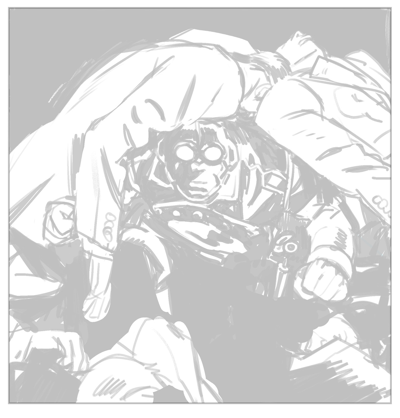
And to wrap up the archival Lobster week, one bit from the last story I did, The Empty Chair.
drawing fotozozo personal work quotes the what and the how uncategorized work for hire writing
And to wrap up the archival Lobster week, one bit from the last story I did, The Empty Chair.

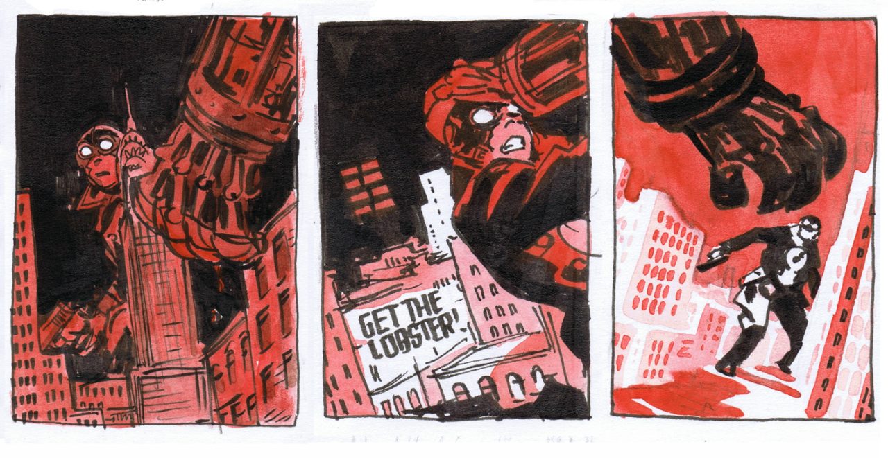
Continuing Lobster week and stepping a year earlier with this one. All the covers back then started as watercolor thumbnails. That was a pretty satisfying way to figure things out, as well as a good method of keeping it simple in terms of color.
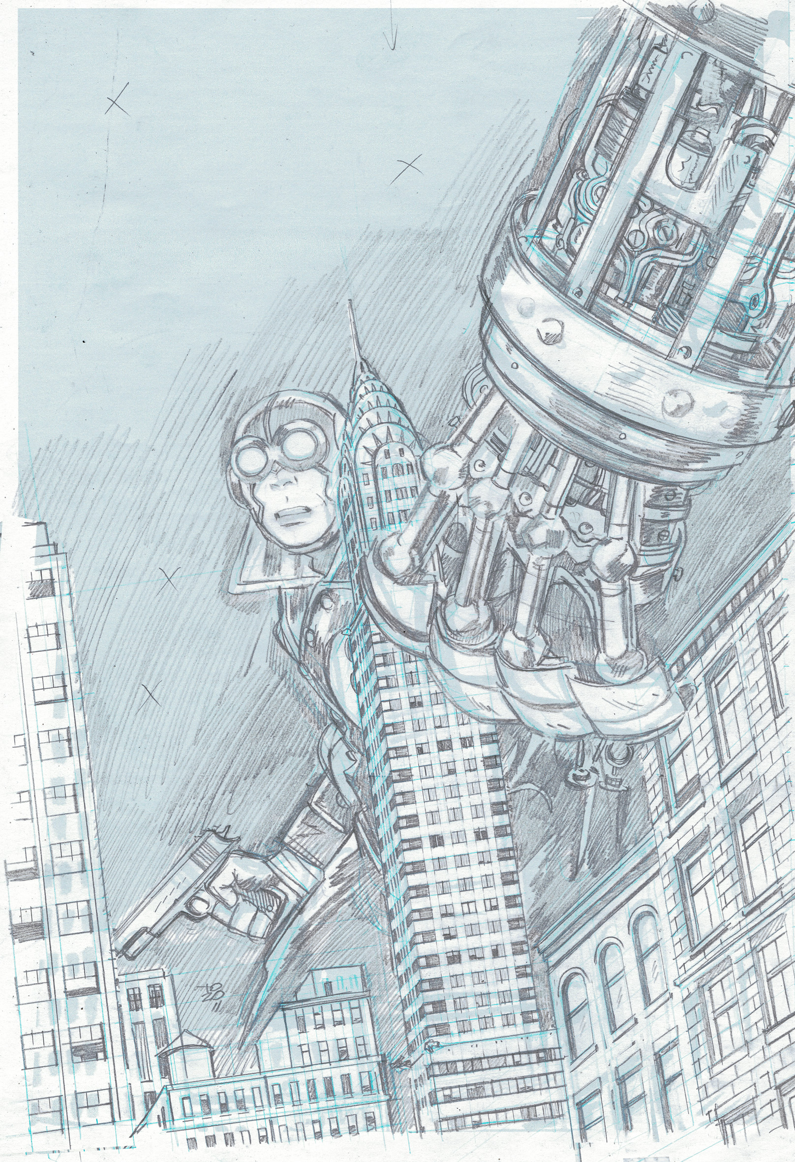
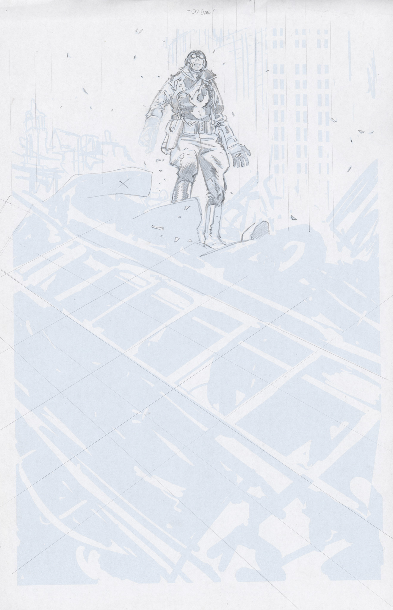
Hey, pencil and paper. I don’t remember why this one wasn’t finished (or why it was started) – maybe I gave up when I got to the part that included any actual drawing – but it’s a view into how things were (not) done circa 2014.
read the whole post —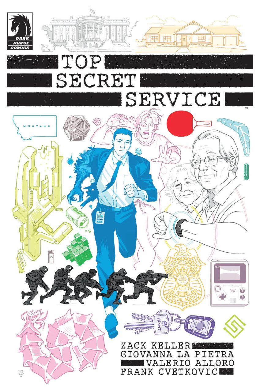
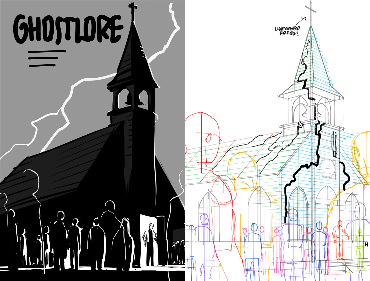
This is for a graphic novel that has so much going on that I thought the best course for the cover would be to include everything (or at least as much as fits on one page).
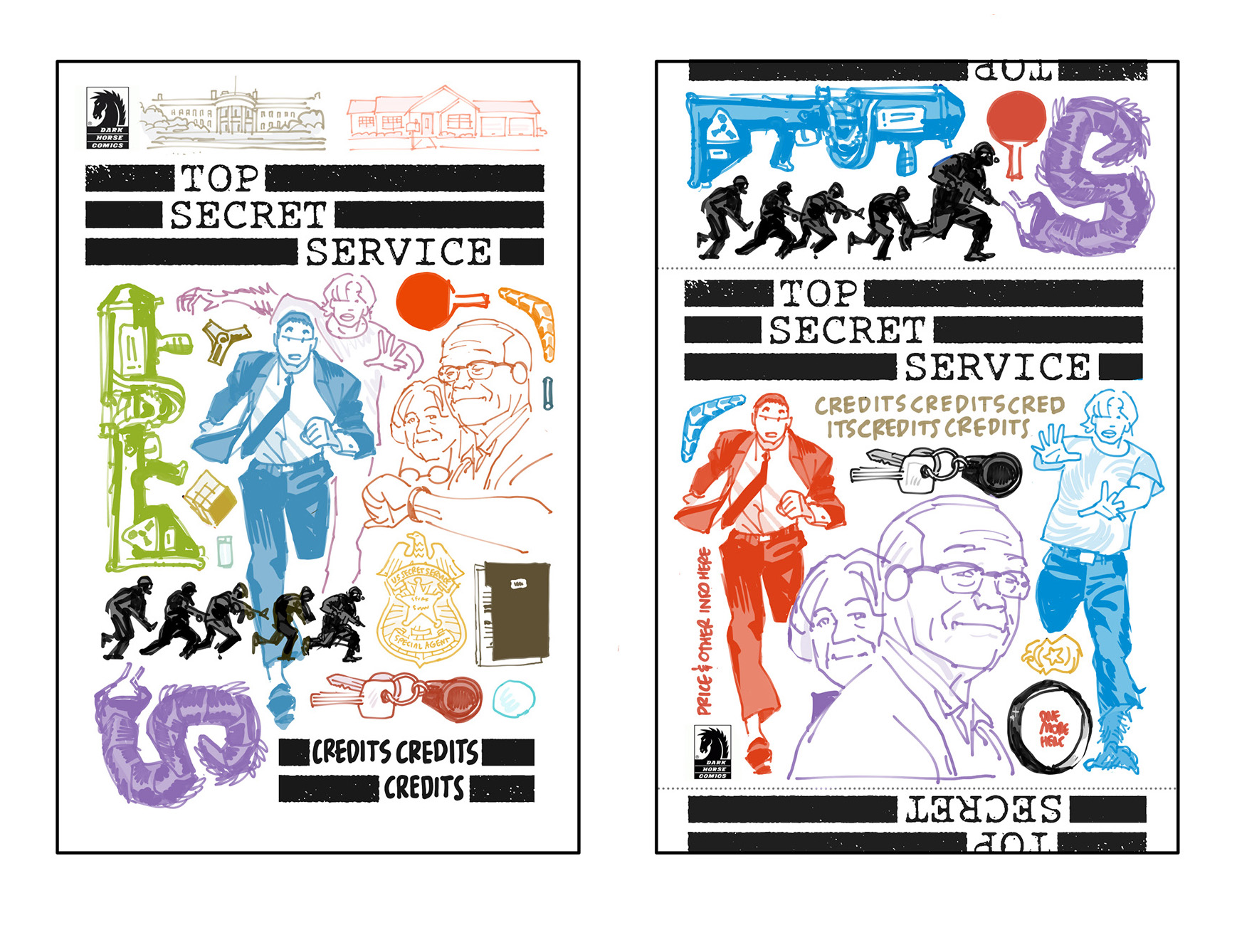
I don’t know why the release image is missing the Dark Horse logo in the top left corner, though, but the roughs below have it.
Edit: It bothered me so much that I went in and added the Dark Horse logo myself. (Why even bring that up? Because balance takes at least fifty times as long as the drawing part, usually– it’s a chronic cartooning condition that eats up the brain. See black areas below.)
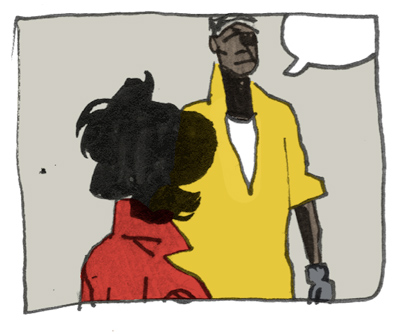
When I have to pick a single favorite page of comics I have done so far, this is the only one that ever comes to mind:
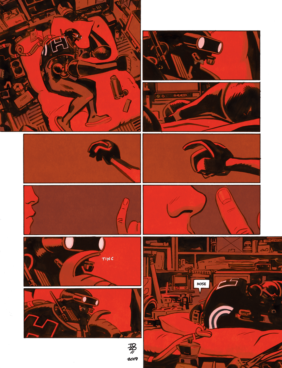
Maybe there are some clues and lessons in there.
read the whole post —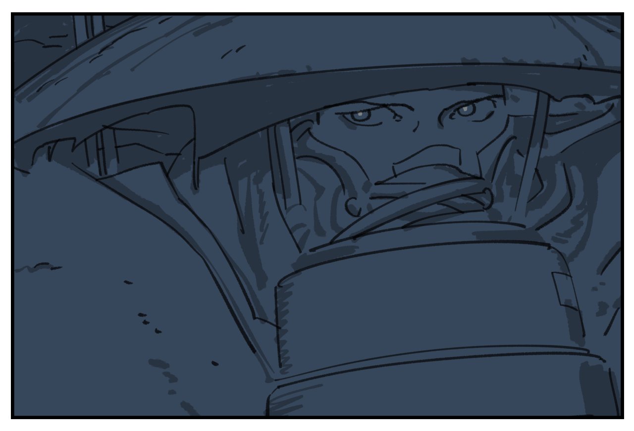
When I set up this new blog six months ago, I made a very conscious effort not to start with a big statement of intent. No manifesto about Why Blogs or I’m Leaving Social Media For Good or anything like that.
I just posted a current thing — a photo I took from the window of a moving car — and then posted a few quotes next, and didn’t make it a big deal in any way. No big plan, no attempts at comprehensiveness. I just needed it to exist without needing it to be anything in particular just yet.
What I was looking for was a better way of being online in some approximation of “real time.”1
Twitter is no longer an acceptable option, if it ever was. Its alternatives, even the good ones, all have the same problems — while they still serve some of the social functions, I need a better way of sharing work and pictures and thoughts in progress at my own pace, with more continuity, more permanence, and more depth (when needed)2.
The blog did already survive the threshold of “two posts, then a three year gap, then an apology for not posting, then death” that most blogs don’t, but now it feels like I do need to decide on -some- approach to it before it sort of peters out.
For artists and creative people, the easiest, go-to model for an “online presence” is to share “process.”
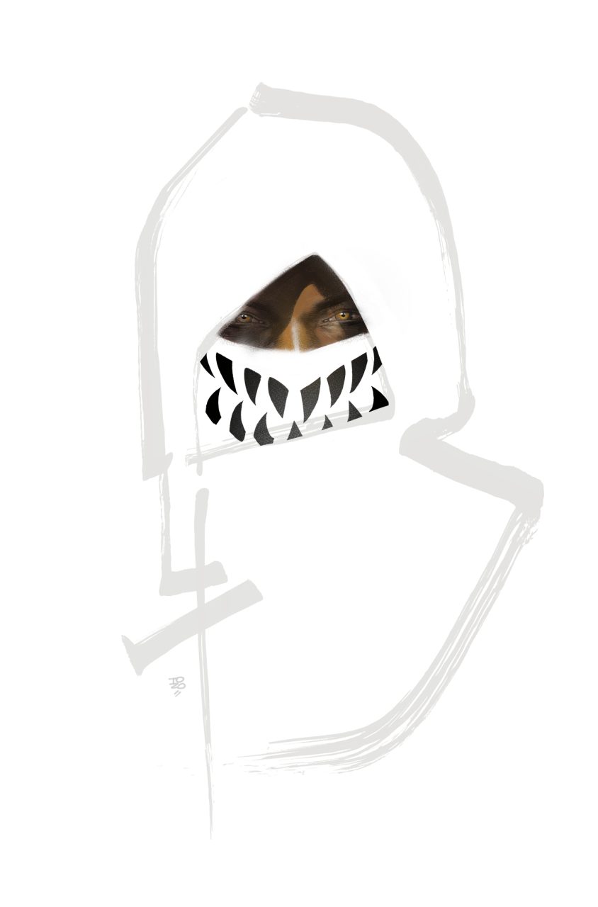
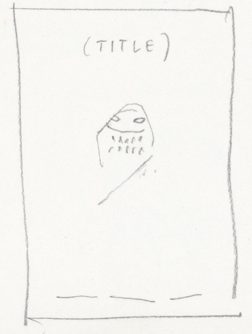
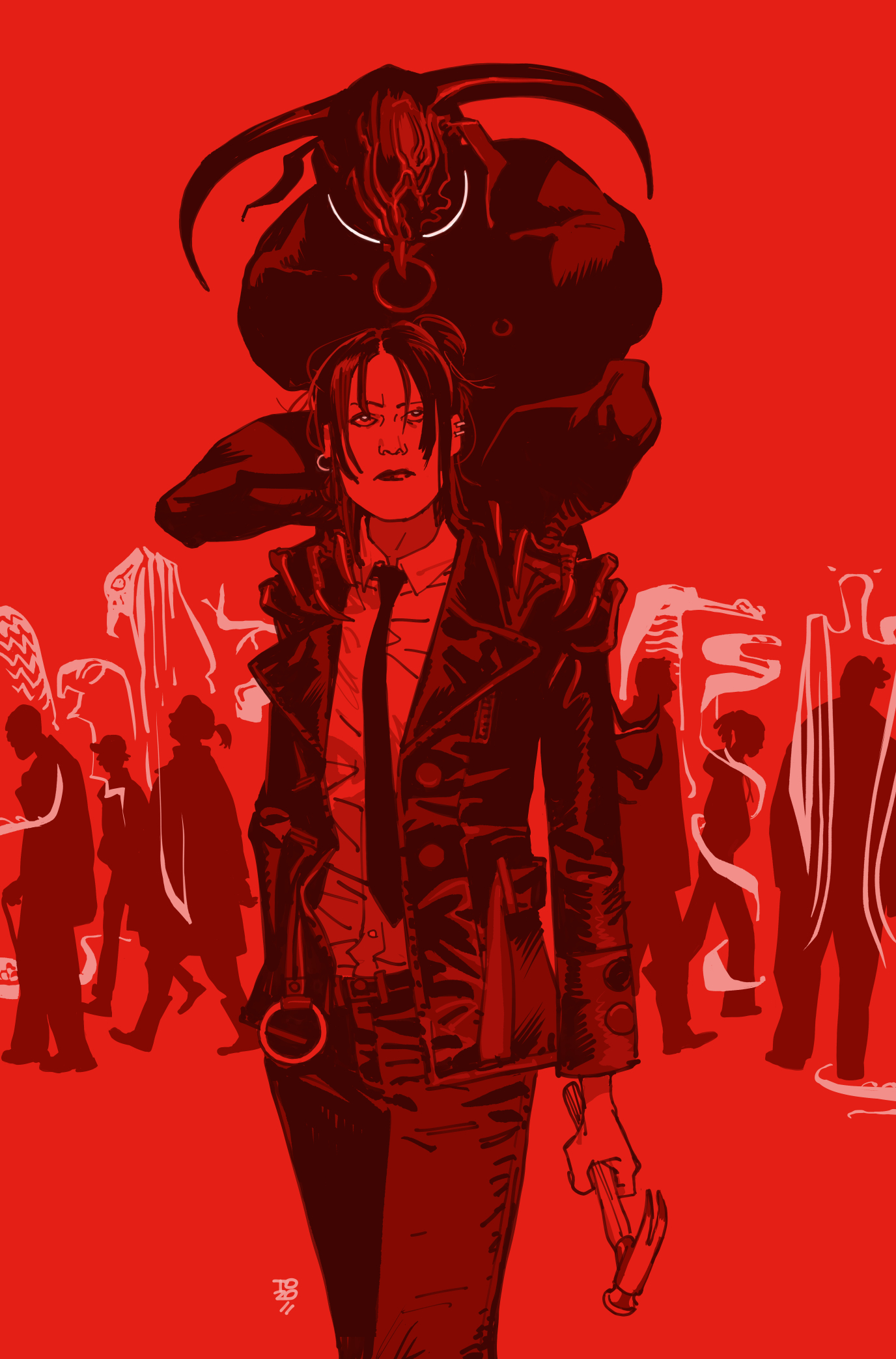
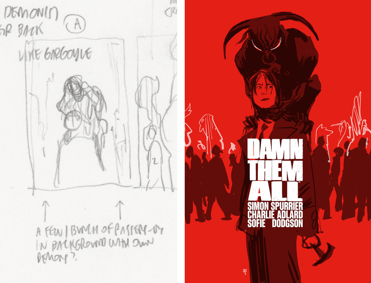
Variant cover for the new Si Spurrier + Charlie Adlard + Sofie Dodgson + Jim Campbell book.
Original thumbnail and rough:
