A hiatus with work and blog (and literally everything else, but that part’s not new), because of the body very much not cooperating again, but there’s still covers I didn’t get to here. More unexpected subject matter too. In anticipation of the last cover, here’s the first four —
(you should be able to click on them and just use the arrow keys)
Knowing I was going to do the whole mini series, I tried to find some throughlines for the covers, because that’s always the impulse, but since I didn’t know much past the first two issues, the first round of thumbnails had to stick with broad directions — places, people —
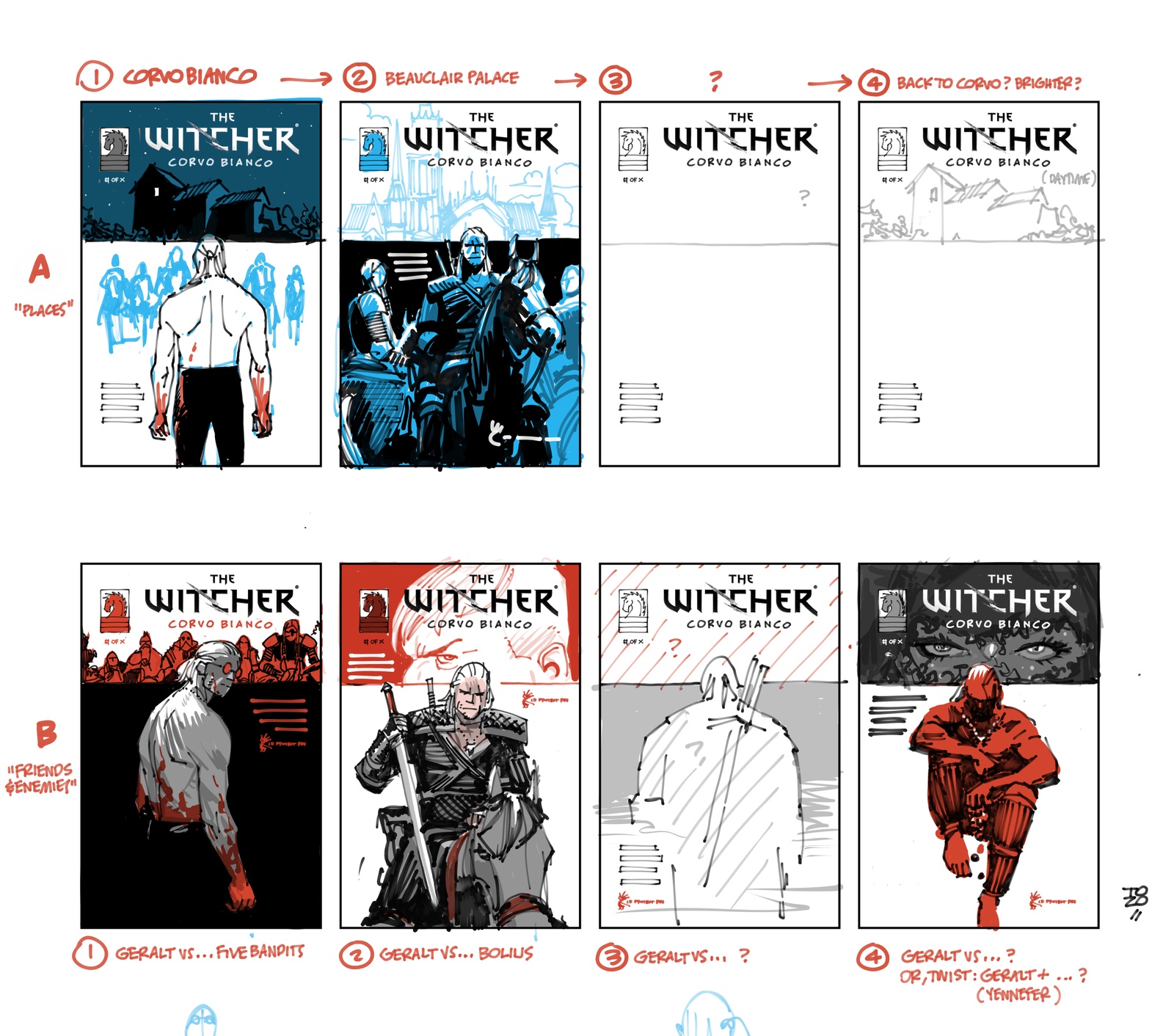
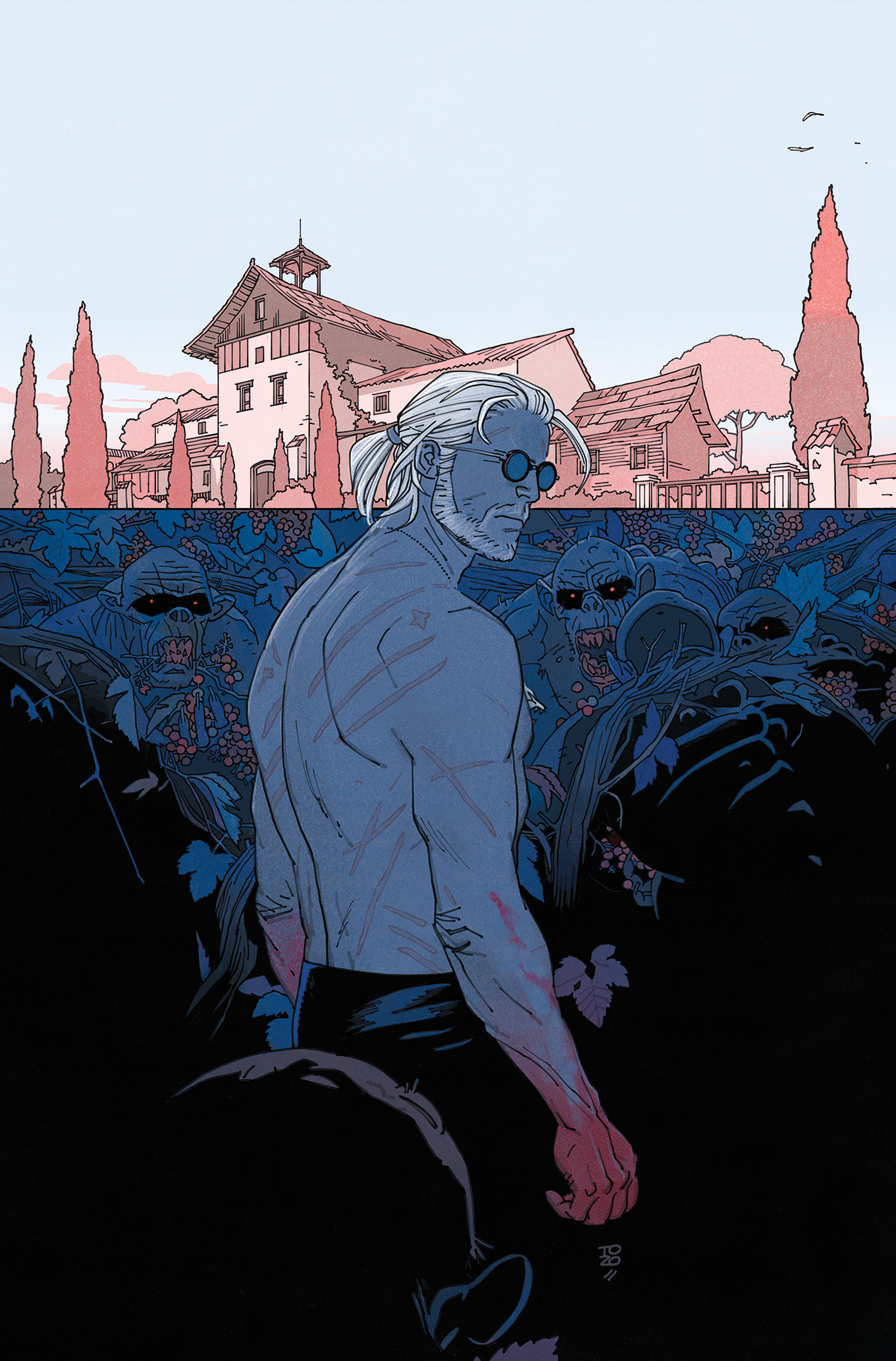
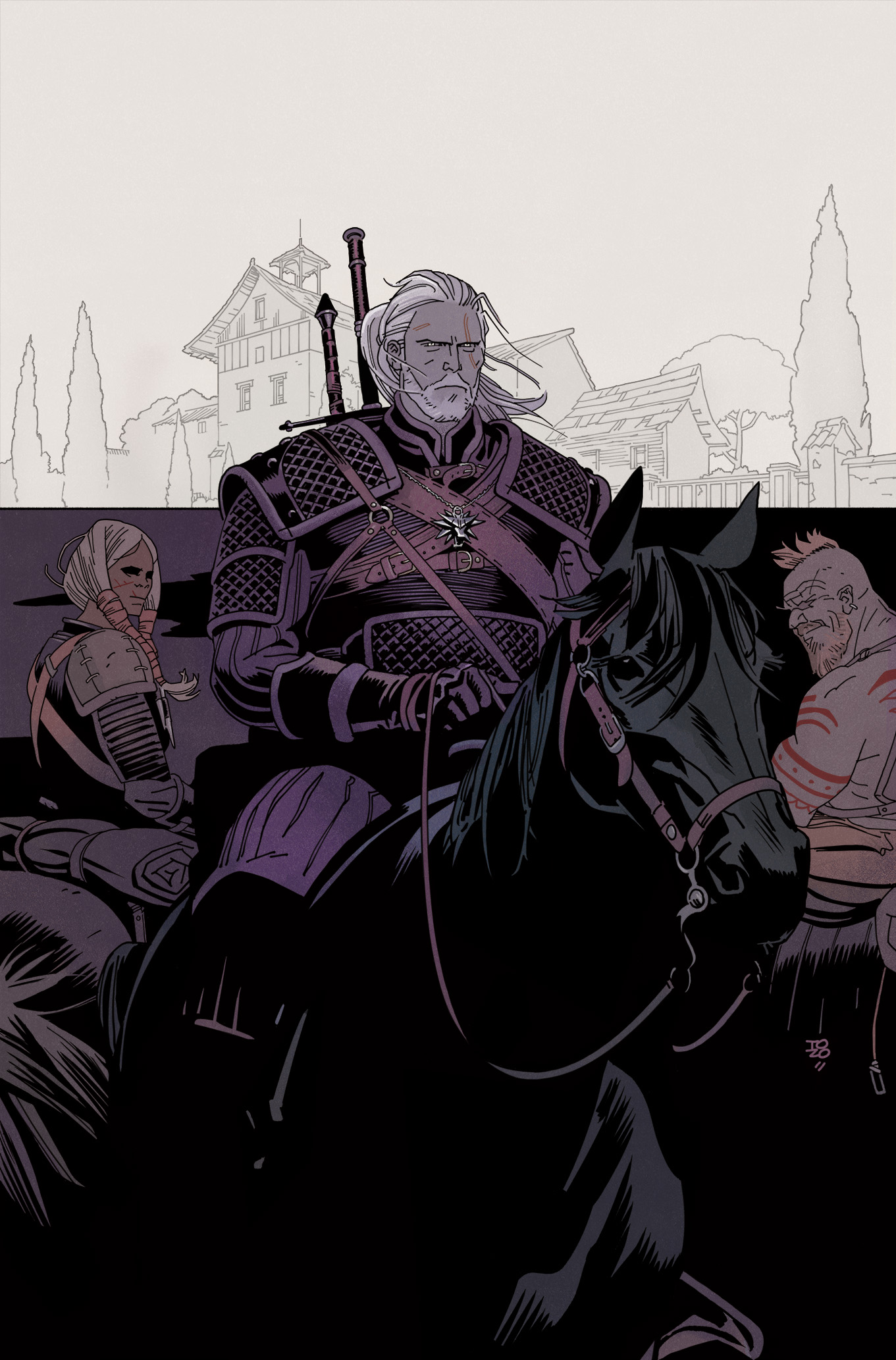
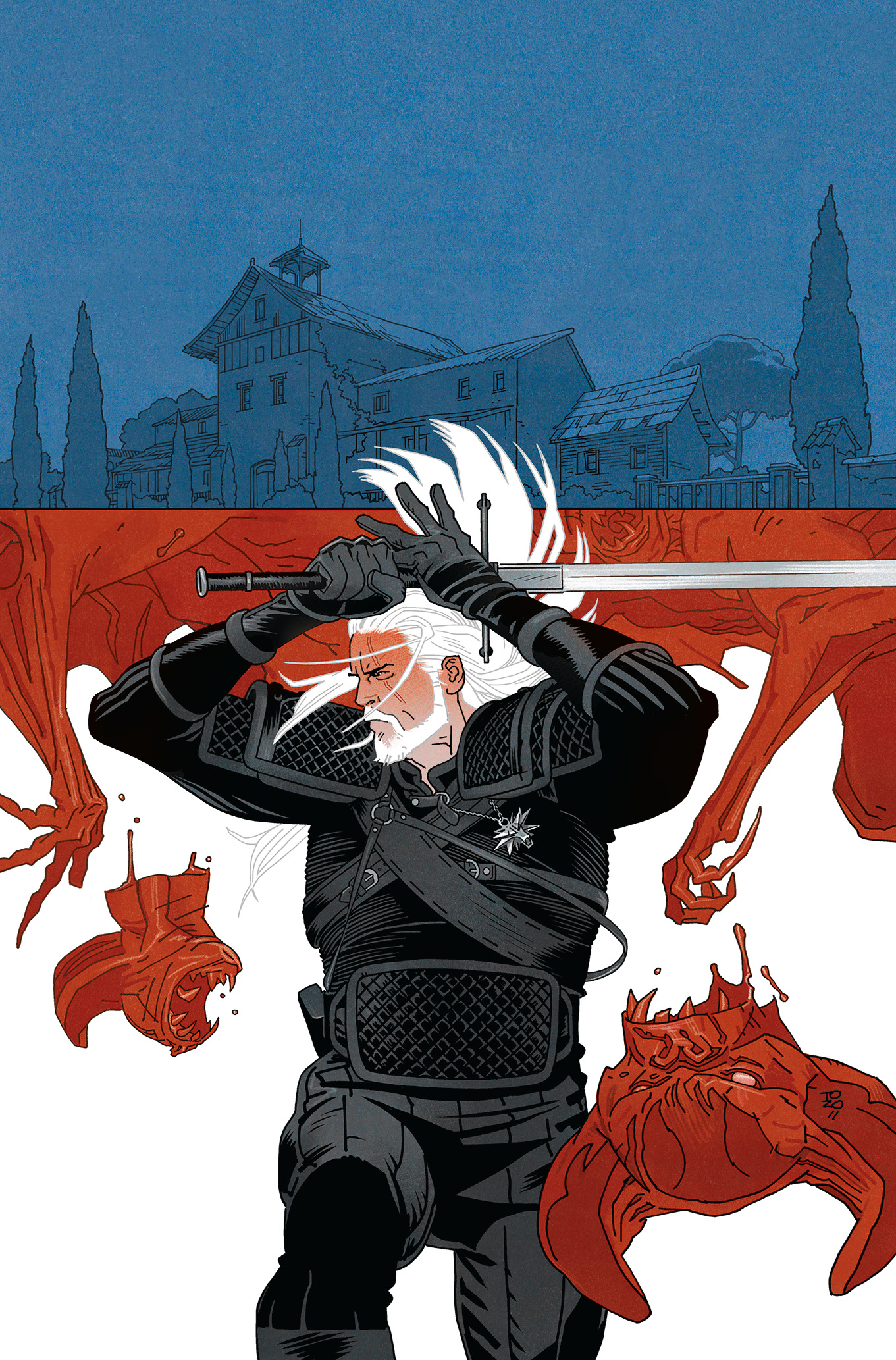
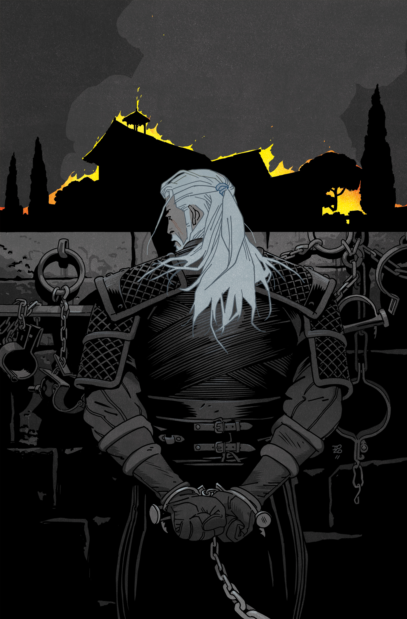
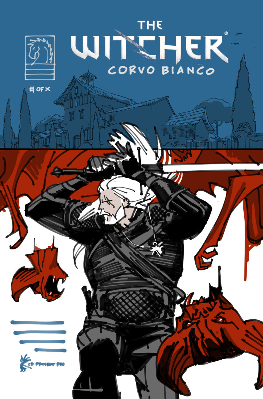
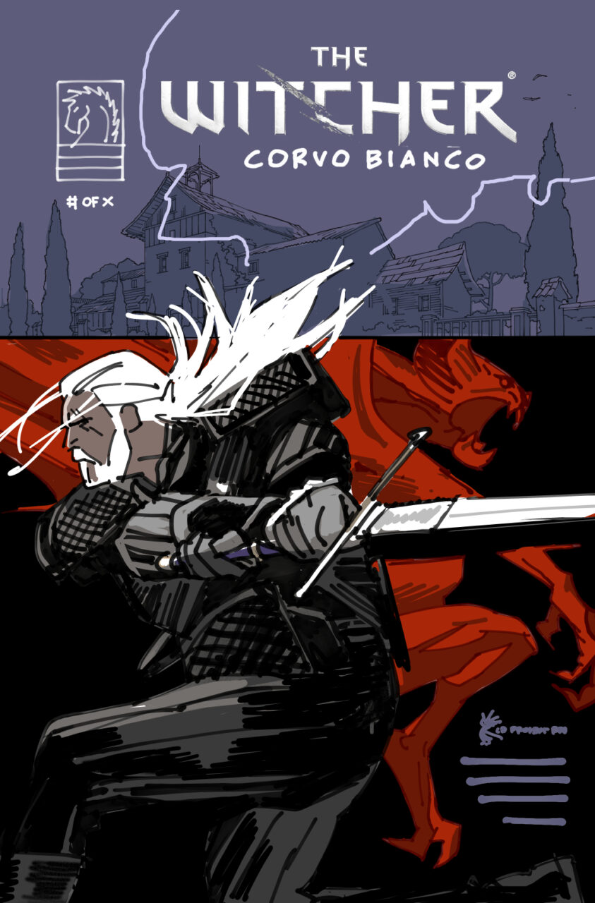
“Single (titular) location at the top” got a thumbs up, and I also found out how it ends, so that gave me the trajectory for at least half of the picture, and some parameters and formal stuff to work with: of course I’d lock down the camera on that location and show five different versions; of course Geralt has to be front and center (to be twisted later, possibly); of course I’d use the division of the background to try and make those cuts do things that more elegant transitions wouldn’t.
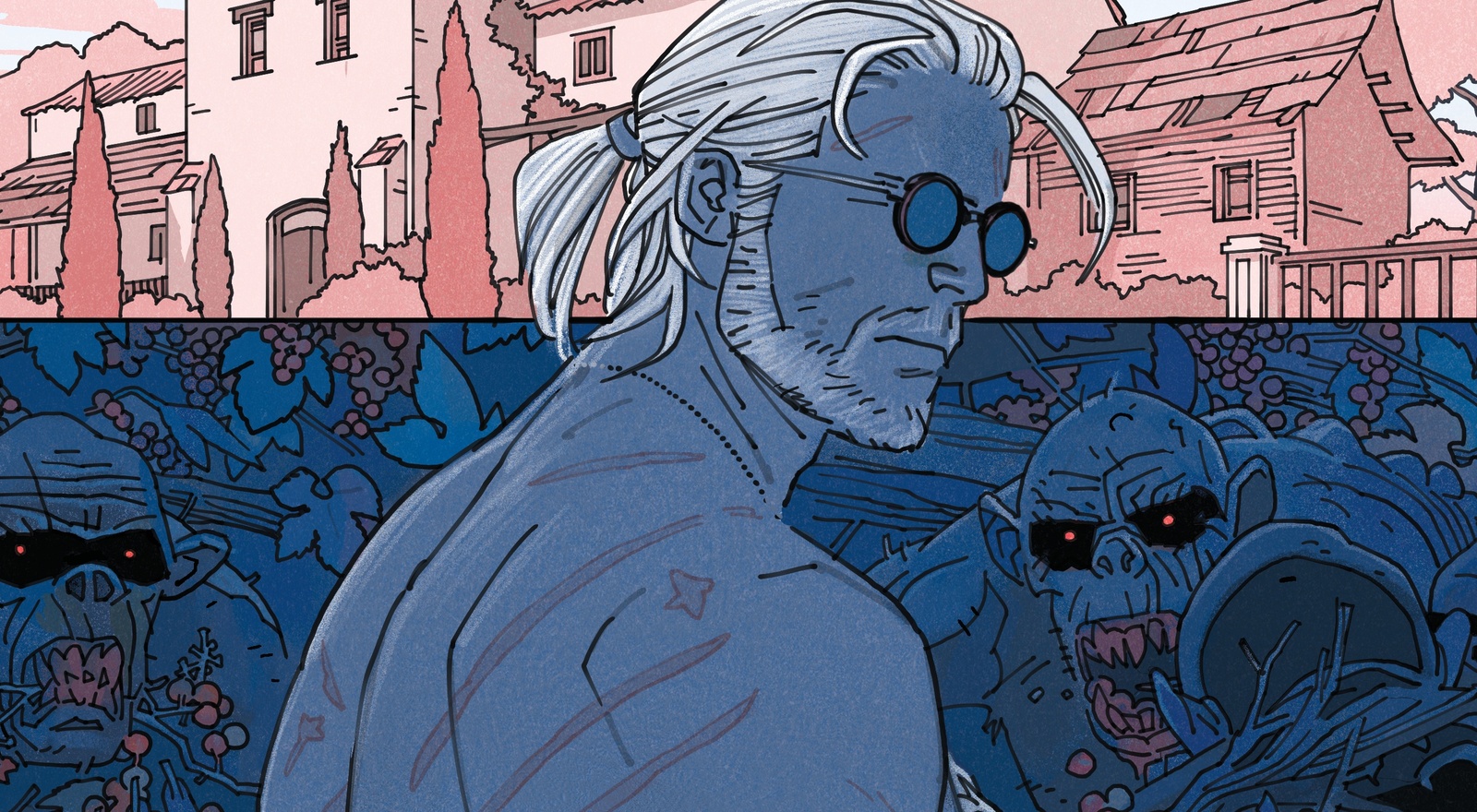
Take the first cover — light color, dark color, contrast of peaceful and threatening, etc.; all fairly by the book stuff — it then feels like a natural next step to go and use those leaves and vines as a perfect decorative transition between the two. Have them maybe creep into the top half, like snakes, etc.
The sharp line instead just makes things… wrong. It’s not particularly wild, I’m not doing formalistic somersaults. It’s not a cubist picture. It’s a small surprise. But it’s just not how a picture is supposed to work. The eyes can’t decide on that edge, like an optical illusion. It doesn’t resolve. I see what it’s doing, yet I can’t really fully verbalize it, the effect remains the same after describing it. I found that exciting. Having that abrupt line immediately felt right, and: the formalist aspects directly related to the story– something being off is communicated there before any thought happens.
That’s always the crucial ingredient, having something just beyond my ability to fully grasp 1, and discovering those is pretty much the entire process of finding a picture 2, the difference between a picture that works or one that doesn’t. Without at least one of those, it all just feels too schematic and finite.
Once the first couple of covers were done, it locked in the rest, so there aren’t many/any additional roughs for the remaining ones. The options narrow down quickly.
There a couple for roughs the third cover, because i couldn’t pick then, even though to me today it’s clear it has to be the first one. It’s not even a close call between the two. I can’t remember what it was — maybe I thought the bright lower half swap should be saved for the next one. Or I thought “maybe they’d want something more dialled up, I can’t just do what I’d like best, the quiet version”, as usual.
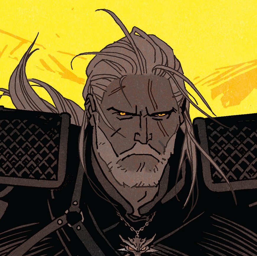
I do like the monster in the background, and you can see me getting the idea to leave out the black shadows from them on the final one.
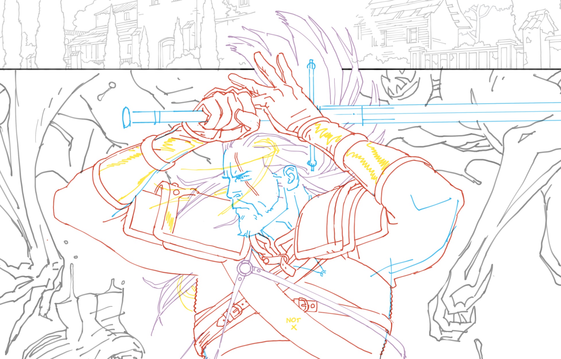
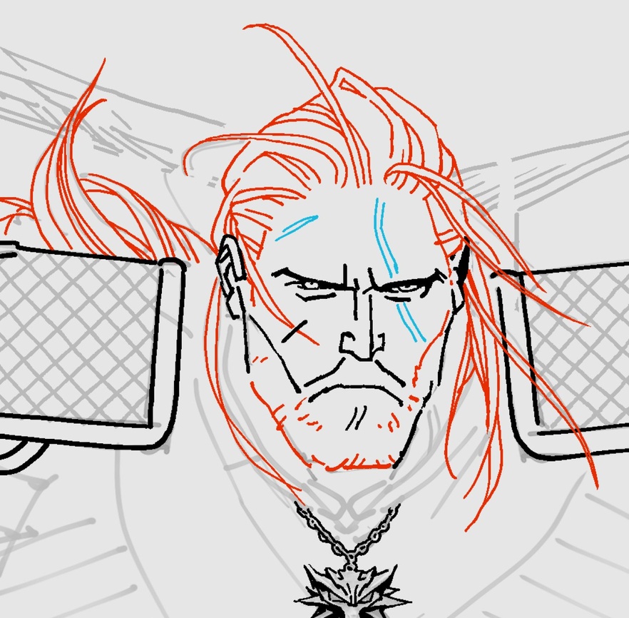
Pencils, just trying to go as fast as I can, ideally having no memory of them at all, no time to solidify them in my memory as what the picture is 3. Sometimes I can’t deal with looking at anything but gray lines, other times I really need the help of color to keep track — this was during one of the rainbow brain times.
Not sure when the last cover will be out, but more pictures, and an all-words post (if I can get it under 9000 words) coming up in the meantime.
(2024/08/08 edit: last one is out, see this post)
Footnotes
1) Of course, there’s always a pretty fair chance, and a substantial historical record, that I’m just too dense to grasp simple or patently obvious things.
2) Some people go completely by their gut, say they aren’t analytical, don’t overthink, use randomness, and so on, and get fun, surprising, electrifying results that way. I am constitutionally unable to not dismantle everything to atoms, and these days I also have to look at things for a very long time, so everything has to survive that process. It’s very exciting when things remain ungraspable (see footnote one again)– it feels more true to life. A rock remains a rock, not a description of a rock.
3) I’ll have to get into that part (at great length) in a future post, tying into the (very lengthy) post about aphantasia, and only being able to visually respond to what’s there, not to an imagined future result. Pencils are just a minefield in that regard. Even with a working brain, It’s easy to end up hypnotizing yourself, especially if you are staring at those pencils for days on end, and end up adjusting things as if the pencils were the final image. Inks then turn out to be either a disappointment or an underwhelming compromise (“it’s nice but it lost a lot of what the pencils had…”). This is why I try to be either fast enough that I don’t have a memory of the pencils at all (not always an option), or use ink as pencils (very easy digitally). But the topic of that kind of translation is too big for a footnote4, in any case.
4) Even a very long footnote.
Leave a Reply