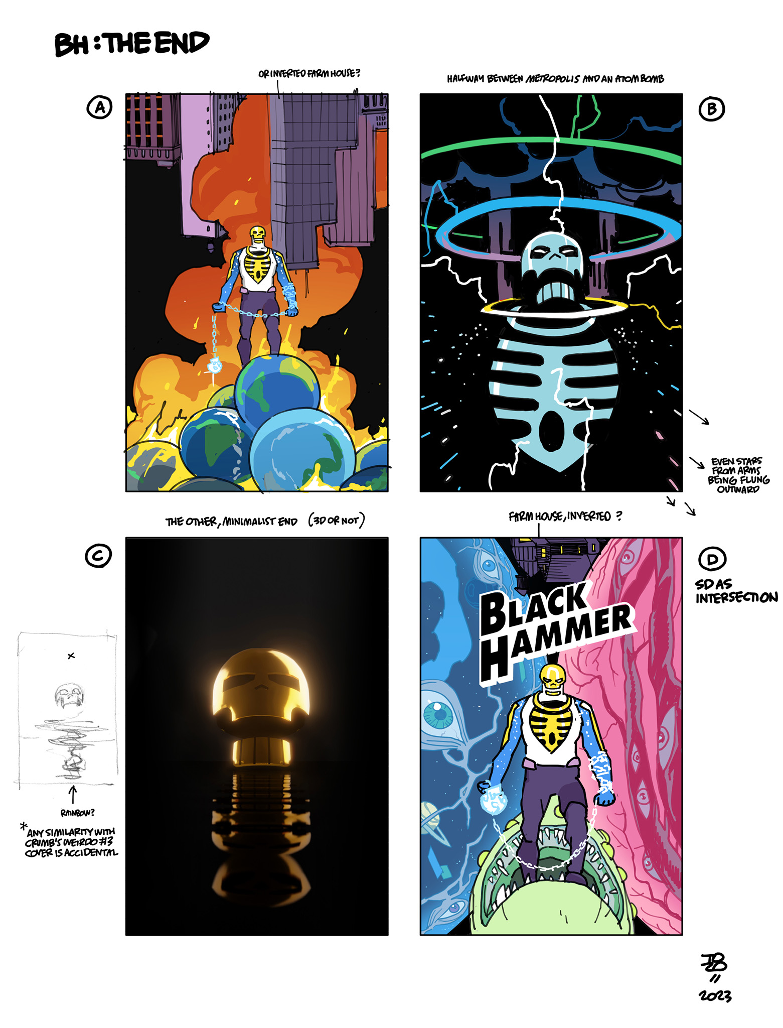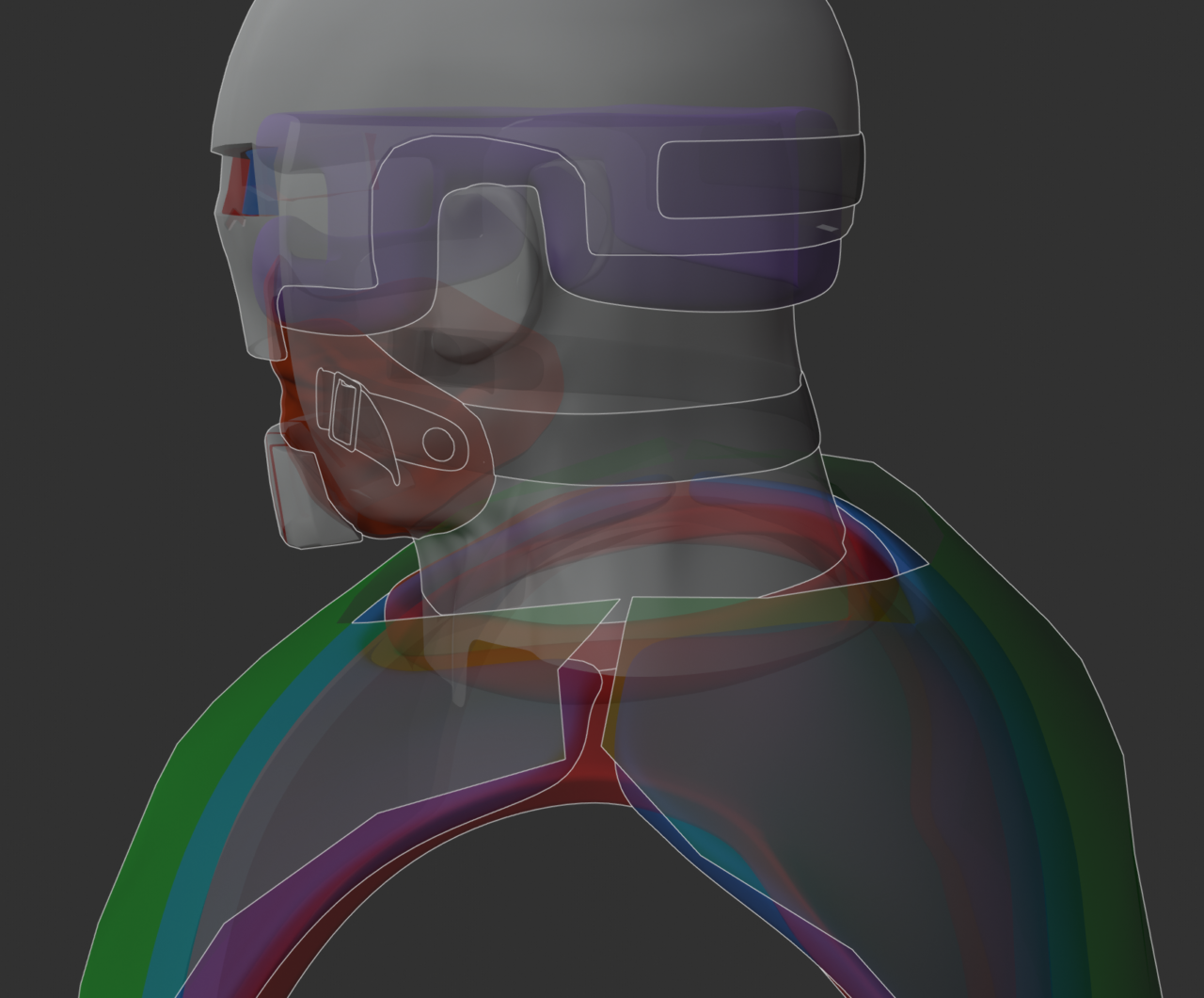
I had a few directions for this one, from the maximalist “just put everything in there” to a 3D one (using the model I made sometime in the middle of issue four of Skulldigger and Skeleton Boy and then promptly forgot to actually use for reference for the rest of the book.)


(No glow-in-the-dark toys yet, alas.)

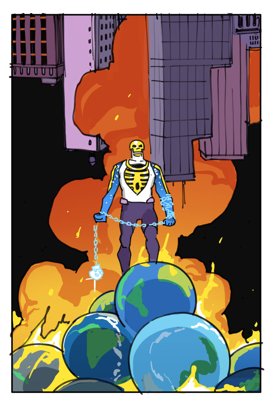
As fun as the one with the stacked pile of Earths seemed, my energy and mood weren’t in the “up to 11” place — it rarely is — and the official covers would do the wild stuff anyway, so I went with the simplest (drawn) one, the one that could work and read clearly as a stamp (or a thumbnail on a website)–

I also liked the idea of it focusing on the “rebuild” of Skulldigger becoming Spacedigger — his new look was designed by Malachi Ward, who’s also drawing the book.

Leave a Reply