drawing fotozozo personal work quotes the what and the how uncategorized work for hire writing


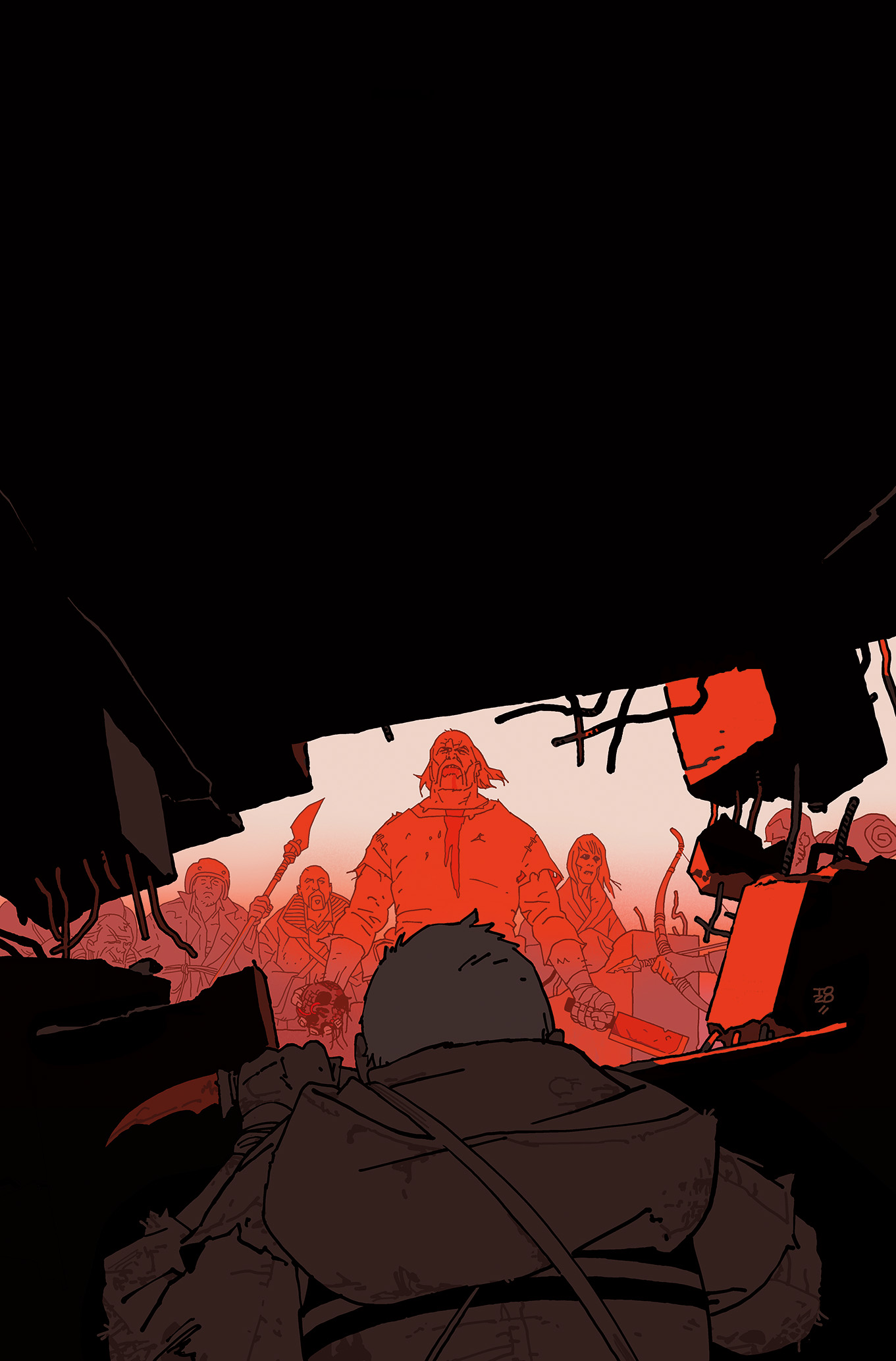
Done during one of my more uphill times, but I was happy to be able to do a cover for Ben Stenbeck’s creator-owned book. And since it’s for another artist, I allowed myself to do it almost how I’d do it for myself.
read the whole post —
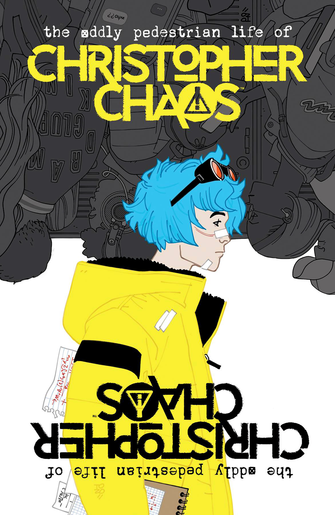
When I did the other Christopher Chaos cover, this was the only alternative idea I had, and the editors approved both (hooray!) so this one was done for a later issue, out in December.
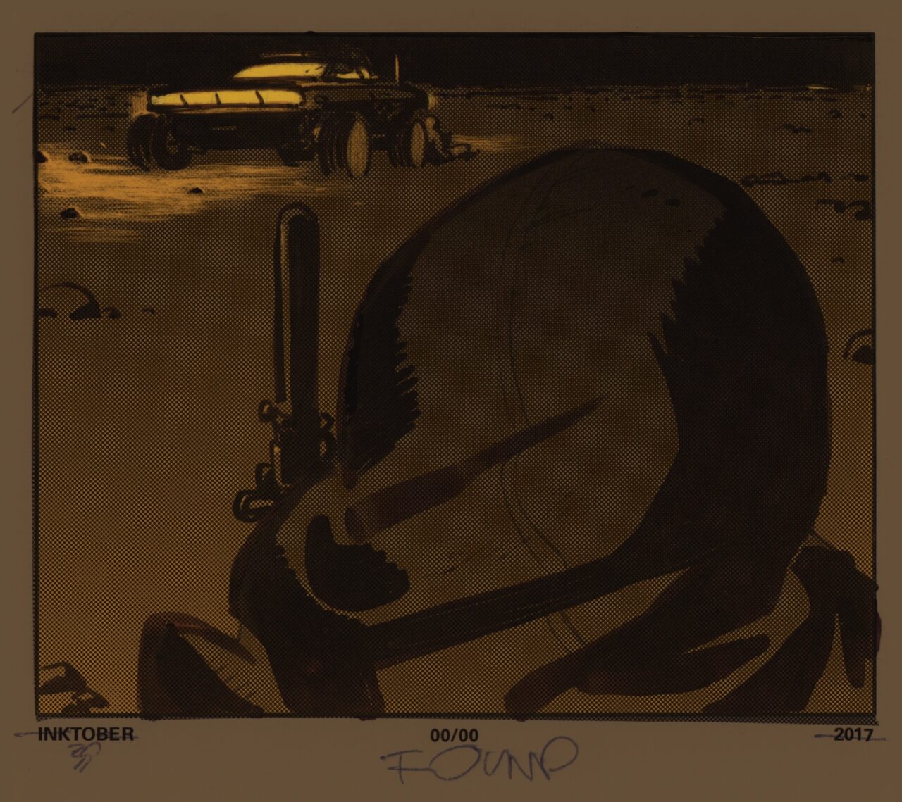
When I did the Inktober book back in 2017, I did some sketched-in copies, and then I colored a lot of those sketches for my own fun. There were enough of them for another book, but I don’t make sketchbooks. Yet I did do a mockup a couple of years ago [for redacted reasons], and I ran into that tonight while clearing out some shelves, and enjoyed seeing it again.
read the whole post —Today I did start the day with a “personal 30”, thirty minutes carved out of any viable work time, because I needed to draw something – anything – just for myself. What I draw for myself:

Sometimes a cover is best as a simple picture of the person standing there, or a dynamic action shot. Other times, a completely different approach works out better and leads to more interesting places. Here’s a case of the latter working out better. How did I end up with these circles?
read the whole post —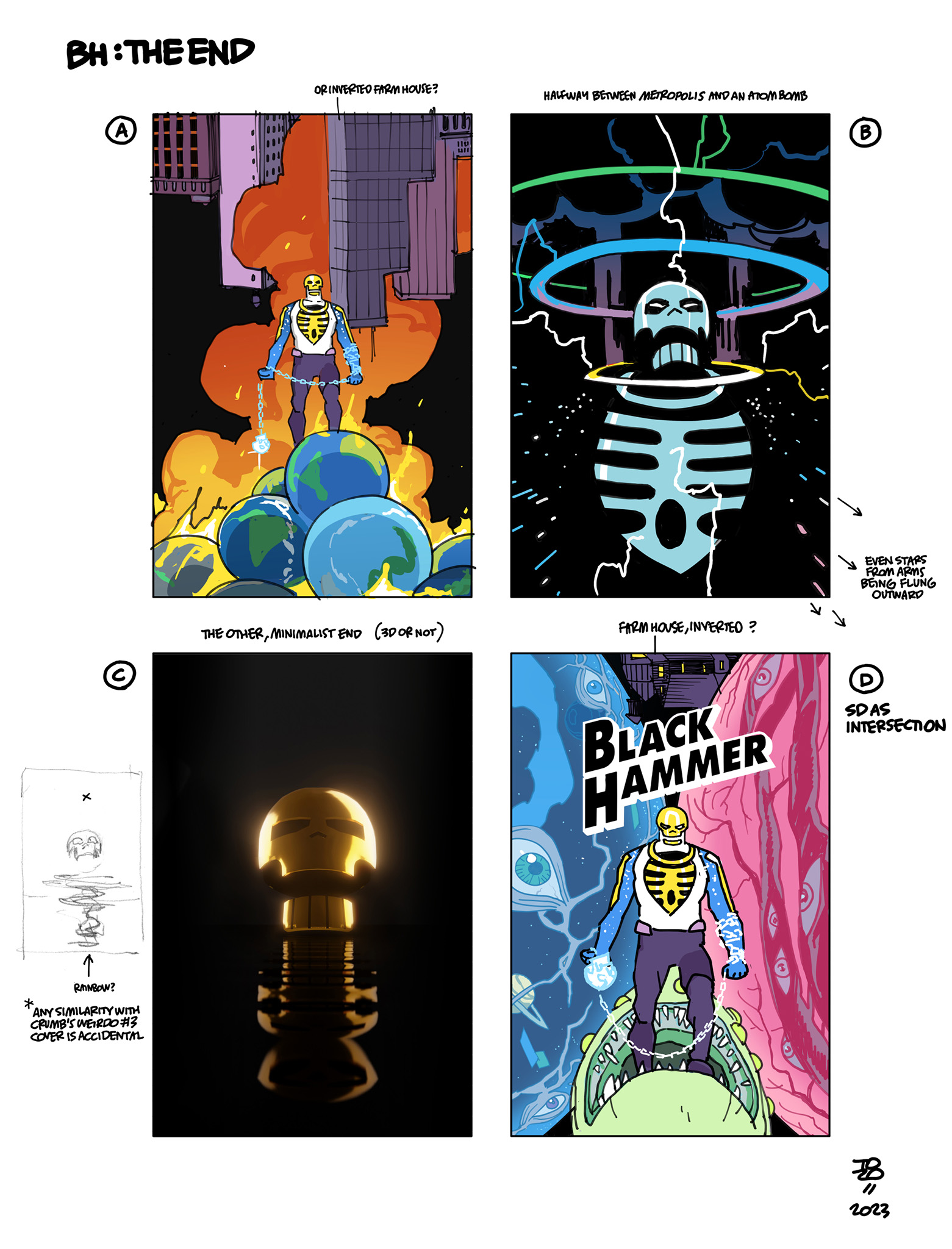
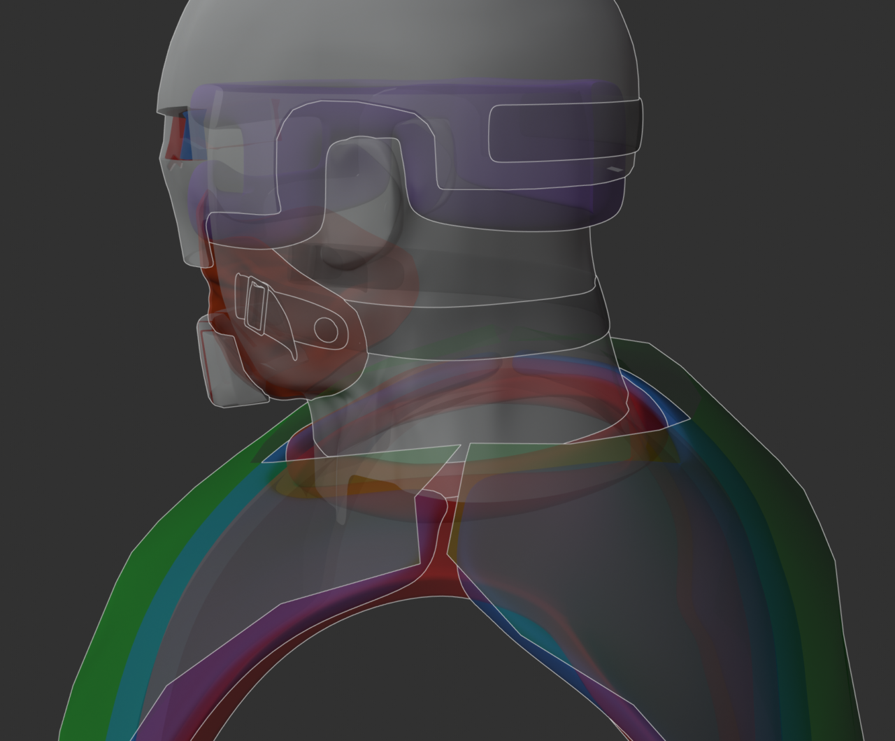
I had a few directions for this one, from the maximalist “just put everything in there” to a 3D one (using the model I made sometime in the middle of issue four of Skulldigger and Skeleton Boy and then promptly forgot to actually use for reference for the rest of the book.)

Sometimes the cover needs a twist, other times the best course is to draw the thing. This was one of the straightforward ones.
read the whole post —
Who knew that drawing an invisible monster would take longer than drawing a visible one?
read the whole post —
The second hardcover omnibus volume is out now, collecting the last (and best) volume I did with John Arcudi, Pirate’s Ghost and Metal Monsters of Midtown, as well as the first book, The Iron Prometheus by Jason Armstrong and Mignola, and short stories that were originally collected in the fifth paperback, A Chain Forged in Life. Roughly 470 pages of Lobster.
read the whole post —And to wrap up the archival Lobster week, one bit from the last story I did, The Empty Chair.

Continuing Lobster week and stepping a year earlier with this one. All the covers back then started as watercolor thumbnails. That was a pretty satisfying way to figure things out, as well as a good method of keeping it simple in terms of color.


Hey, pencil and paper. I don’t remember why this one wasn’t finished (or why it was started) – maybe I gave up when I got to the part that included any actual drawing – but it’s a view into how things were (not) done circa 2014.
read the whole post —
This one could qualify as archival too, since it was drawn in 2021, but it’s personal work, and not out yet, so instead it’s a peek at the ongoing present, as I rework some of it this morning.

Last year I spent a fun afternoon coming up with some “home-made” costume concepts for an IKEA ad. The idea was that the girl in it progresses from making cardboard outfits as a child to growing up into a career in 3D and VFX. The final commercial mashed together pieces of my other ideas, but these were my favorites as drawings.
(Free Halloween idea, and maybe the green screen one can work in some sort of St. Patrick’s Day scenario too.)
