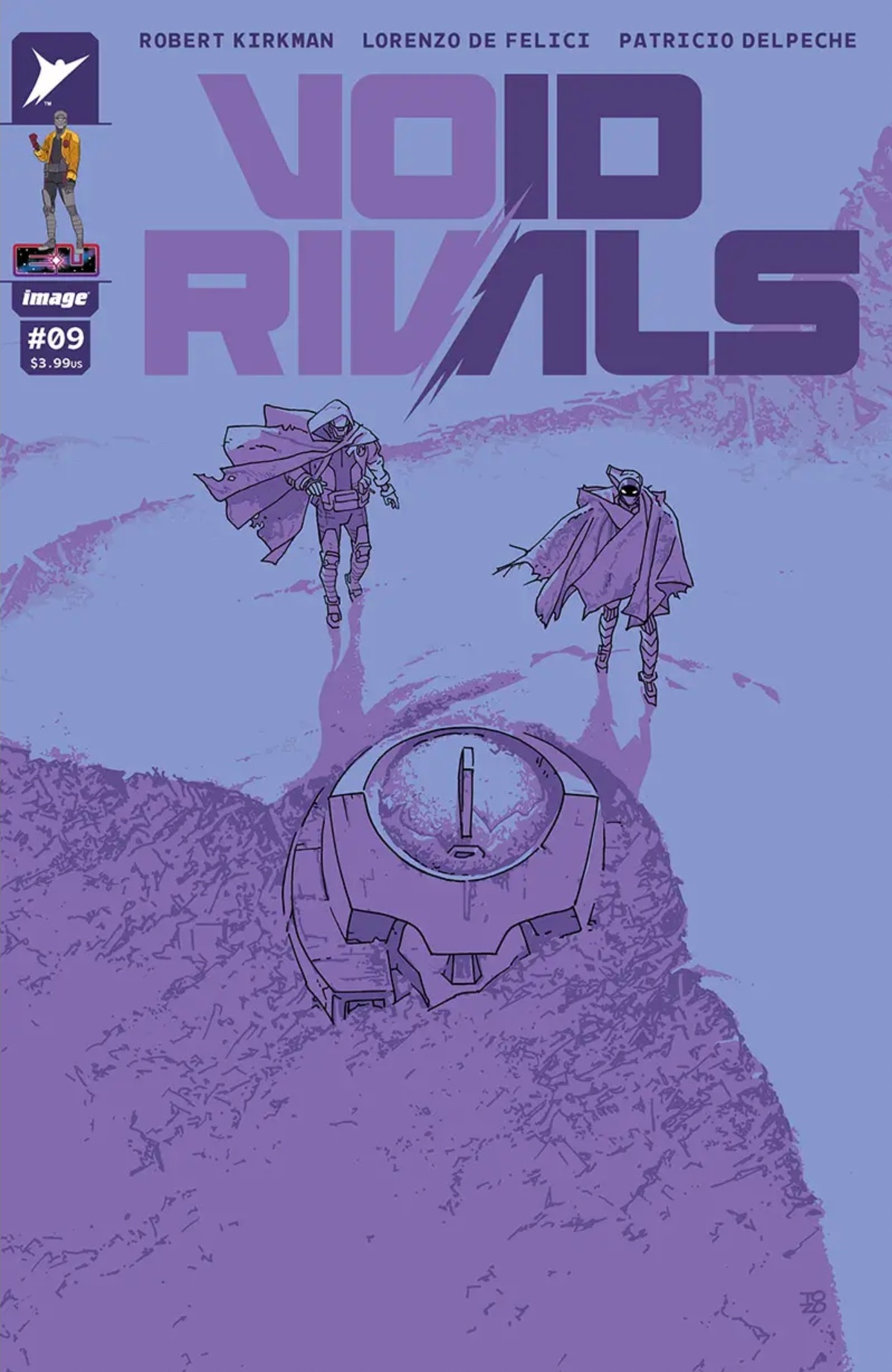
A few uphill weeks in a row again, but some recent covers are coming out, so here’s one:
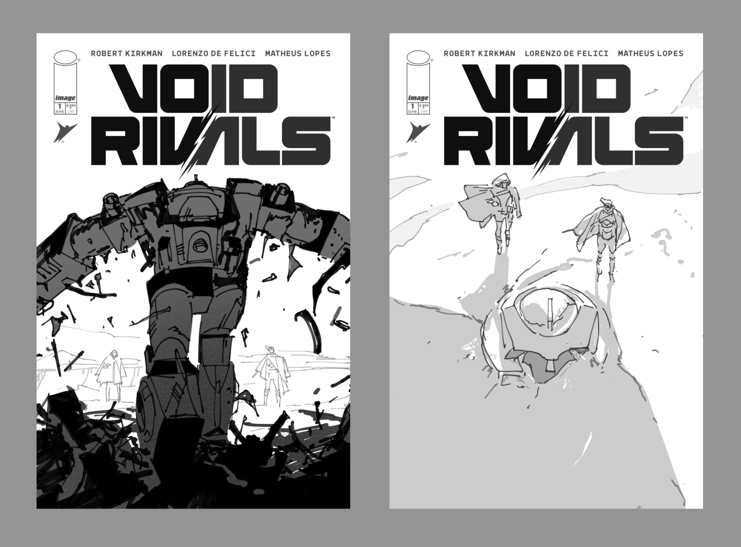
I’m always surprised when I send in multiple roughs and the quietest one gets picked, but hey, fine by me — quiet is usually my favorite, even if I’m still not confident enough to not include the louder ideas. The minimal aspect of things always seems like a way to make it easier, but as Kazuo Oga says–
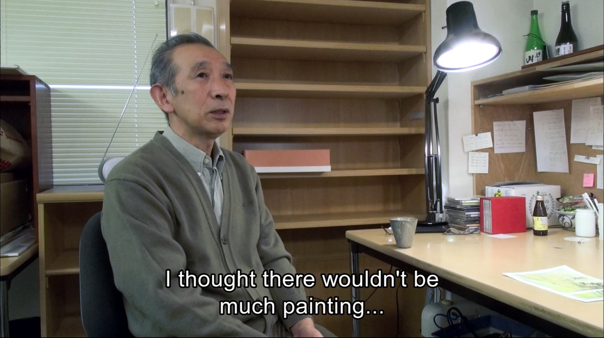
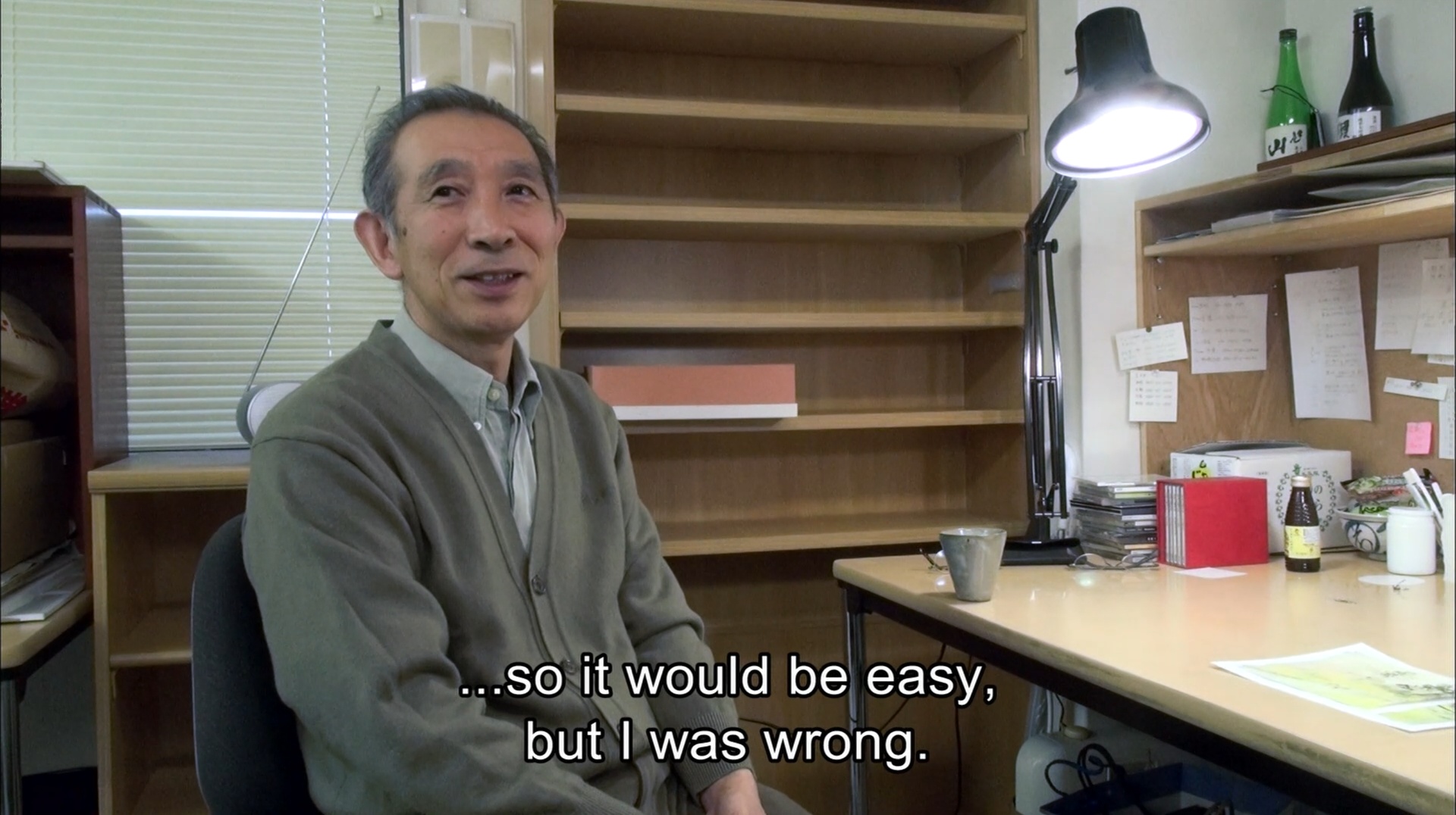
The minimal ones end up taking just as long as the “draw everything” ones — sometimes longer. If there’s three things in the frame, you just want to pick the right three things and get them right.
And as always, the image is designed with the logo in mind, but here’s the clean version, featuring (because I’m stupid that way) very minutely tuned colors from the absolute edges of printable CMYK gamut (at least no blues this time) —
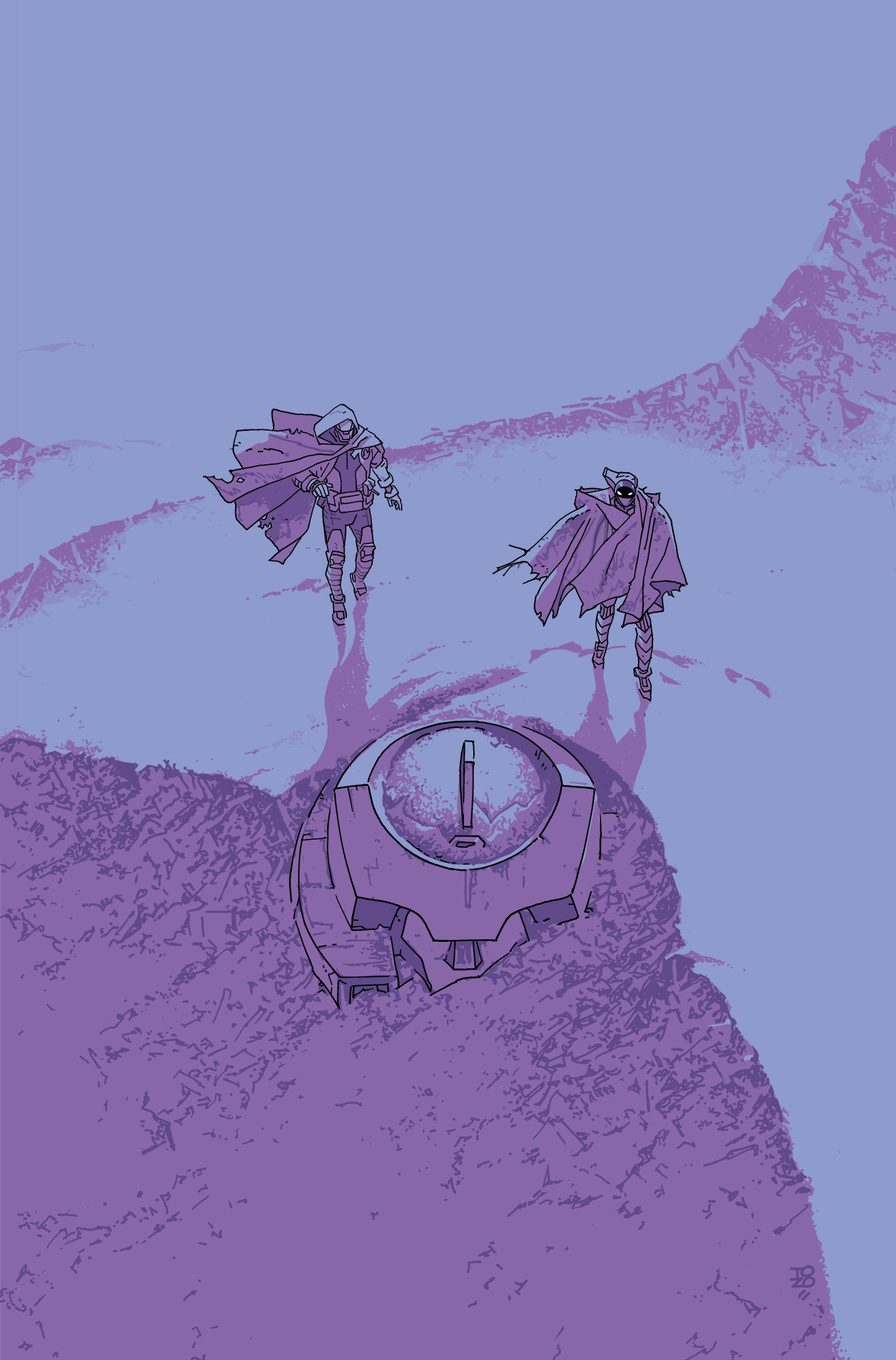
(It was fun to secretly sort of bring these characters to one of my places too, but don’t tell anyone.)

Leave a Reply